
Docket PV-005 · Packaging and Identity · 2009
Tropicana redesigned its orange juice carton and lost a fifth of its sales
On trial: Was Tropicana right to redesign the packaging of its market-leading orange juice in 2009?
FAIL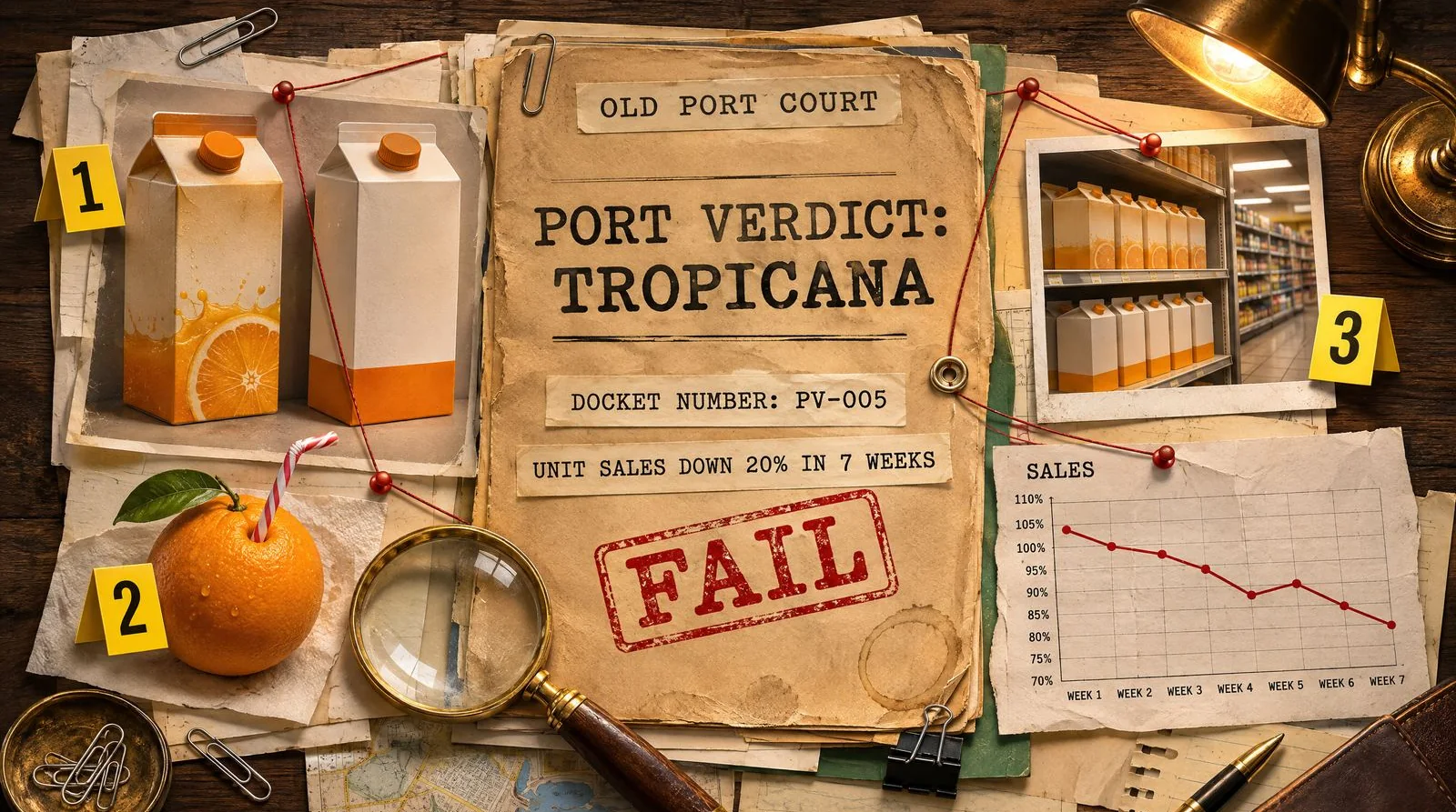
The case in brief
In January 2009 Tropicana replaced its familiar orange-and-straw Pure Premium carton with a minimalist design by Arnell Group. Shoppers complained, unit sales fell 20 percent in seven weeks according to IRI data reported by Ad Age, and the old carton was back within about two months.
The case in numbers
The case
In early January 2009, PepsiCo's Tropicana changed the cartons of Tropicana Pure Premium, the market leader in its category with more than USD 700 million in North American sales. For years the pack had shown an orange pierced by a drinking straw, with the brand name in a familiar position. The new design, created by Peter Arnell's Arnell Group, an Omnicom agency, replaced the orange with a close-up of a glass of juice, moved the brand name, added the line "100% orange pure and natural" and introduced a new orange cap shaped to be squeezed. It launched alongside a "Squeeze" advertising campaign that The New York Times put at more than USD 35 million.
Less than two months later, on 22 February, The New York Times reported that Tropicana would bring back the old carton. The decision on trial is the redesign itself: whether it was wise to change almost every visual cue on a market-leading pack at once. The speed of the reversal is part of the evidence.
The evidence
What changed on the shelf
Arnell defended the work at a press event, arguing that earlier packs had always shown the outside of the orange while the new one showed the juice inside, and linking the squeezable cap to ideas of squeezing and hugging. Shoppers saw it differently. According to NPR, customers wrote in to say the new box resembled a generic store brand, and others called it ugly or stupid.
A later analysis by Perception Research Services, a packaging research firm, published in Packaging Strategies, identified the practical problems. The redesign removed the straw-in-orange icon that shoppers used to spot the brand, changed the main visual and moved the logo. It also weakened the colour-coding between varieties and moved descriptors such as "No Pulp" to the top of the carton, where shelf edges often hid them. In a category bought quickly and by habit, those were the cues people relied on.
Not everything was thrown out. When the reversal was announced, Tropicana kept the new squeezable cap and continued the Squeeze advertising across television, print and outdoor, according to designboom. That choice is telling. The company treated the problem as the front of the carton, the part shoppers scan in a second or two on a crowded shelf, rather than the advertising idea or the product itself. In other words, the brand's own response located the failure in the cues that help people find and recognise the pack.
What the sales data shows
The best-sourced numbers come from Information Resources Inc (IRI) scanner data, reported by Ad Age on 2 April 2009 and summarised by Bloomberg the same day. Between 1 January and 22 February 2009, unit sales of Tropicana Pure Premium fell 20 percent. Dollar sales fell 19 percent, about USD 33 million, to USD 137 million. Over the same weeks competitors gained: varieties of Minute Maid, Florida's Natural and Tree Ripe posted double-digit unit increases, and private label grew too.
Two cautions apply. The window is short, roughly seven weeks, and it fell during a recession, so the data does not by itself separate the effect of the pack from pricing, promotion or wider shopping habits. But the pattern of rivals growing while the leader fell is consistent with shoppers either failing to find the product or reading it as a different one.
Perception Research Services later estimated that the episode cost at least USD 50 million once lost sales, advertising, design, production and distribution were counted. That is a vendor's estimate rather than a company figure, and should be read as such.
How Tropicana explained the reversal
Tropicana did not cite sales data when it backed down. Neil Campbell, president of Tropicana North America, told The New York Times that the complaints amounted to a fraction of a percent of the people who bought the product, but that they came from the brand's most loyal consumers. "We underestimated the deep emotional bond" that those customers had with the original packaging, he said, as also reported by The Daily Beast. He added that the cost of the change was not significant, and that the Squeeze advertising would continue.
The IRI figures published six weeks later suggest the commercial stakes were larger than a complaint count implied. Whatever Tropicana knew internally at the time, the public lesson is that a small number of vocal complaints can sit on top of a much larger number of shoppers who simply switch brands without saying anything.
The verdict
FAIL. The redesign removed most of the visual cues that shoppers used to find the market leader on a crowded chilled shelf, and it did so all at once. Unit sales fell by a fifth in seven weeks while named rivals grew, and the company abandoned the design in under two months. For a decision whose purpose was to strengthen the brand, that is a clear failure.
Some credit is due. Tropicana listened, reversed quickly and said plainly that it had misjudged its customers, which almost certainly limited the damage. The sales data also has limits: a short window in a difficult economy, with no published control for price or promotion. And the reversal decision itself would pass on its own. But the redesign is the decision on trial, and the evidence against it is consistent across shoppers, sales data and the company's own explanation.
What Indian brands can take from it
Indian FMCG brands sell through crowded kirana shelves and quick-commerce grids where shoppers decide in seconds. Tropicana's mistake is easy to repeat:
- Know your distinctive assets before you touch them. List the colours, icons, shapes and positions shoppers use to find you, and protect them unless you have evidence they no longer work.
- Test at the shelf, not in the boardroom. Ask real shoppers to find your product among competitors, in store and on app screens, before rollout.
- Change a market leader in stages. Evolve one cue at a time, so customers can follow the brand and you can see which change moves sales.
- Watch weekly sales and be ready to reverse. Silent switching shows up in sell-out data long before it shows up in complaints.
Our logo design and brand identity team plans packaging refreshes around these distinctive assets. Before any redesign, work through our rebranding checklist for Indian businesses.
Timeline
New Tropicana Pure Premium cartons by Arnell Group ship, backed by the Squeeze campaign.
Customers write, email and call to complain that the carton looks like a store brand.
The New York Times reports Tropicana will bring back the orange-and-straw carton.
Ad Age publishes Peter Arnell explaining the failed package design.
The original carton design returns to shelves.
Ad Age reports IRI data showing a 20 percent fall in unit sales.
Perception Research Services estimates the episode cost at least USD 50 million.
Lessons for Indian brands
- Changing every visual cue on a market-leading pack at once makes the product hard to find for the shoppers who buy it most.
- A small number of complaints can signal a much larger group of customers who switch brands without saying anything.
- Shelf and sales tests with real shoppers are a cheaper way to learn than a national launch.
- Reversing a failed change quickly and admitting the mistake limits the damage, but it does not undo the cost.
Questions people ask
Why did Tropicana change its packaging back?
Loyal customers complained that the new carton looked like a generic store brand. Neil Campbell, president of Tropicana North America, told The New York Times the company had underestimated their emotional bond with the original design, and the old carton returned within about two months.
How much did the Tropicana redesign cost in sales?
Ad Age, using Information Resources Inc data, reported that unit sales fell 20 percent and dollar sales 19 percent, about USD 33 million, between 1 January and 22 February 2009. A packaging research firm later estimated the total cost at at least USD 50 million, but that is an estimate.
Who designed the 2009 Tropicana packaging?
Arnell Group, led by Peter Arnell and part of Omnicom, designed the carton and the accompanying Squeeze advertising campaign.
What was wrong with the new Tropicana carton?
It removed the straw-in-orange image, moved the logo and weakened colour-coding between varieties, so shoppers struggled to recognise the brand and tell products apart. Some said it looked like a store brand.
Evidence
- Ad Age: Tropicana line's sales plunge 20% post-rebranding
- Bloomberg: Tropicana fiasco from Arnell is gift that keeps giving
- NPR Morning Edition: Consumers reject new Tropicana carton
- The Daily Beast: Tropicana's marketing goof
- Packaging Strategies: Managing risk in a package redesign, what can we learn from Tropicana?
- designboom: Consumers want the old packaging of Tropicana juice back
- Logo Design Love: Peter Arnell defends Tropicana rebrand
Port Verdict is independent commentary based on public sources. Brand names are trademarks of their owners; no affiliation is implied.